Why we didn’t merge them
Two large-print brands, one owner, the same customers. Everyone would tell you to consolidate. We built two of everything instead, and I can tell you exactly why.
largeprintbooks.com- Role
- Brand, design, front end
- Scope
- 2 identities, 2 sites, quoting and checkout
- Team
- Me and one developer
- Status
- Both live
A website from 2003 and an owner who knew exactly what he was doing
Latiker manufactured large-print books. The website looked like it belonged in the early 2000s and there was no recognizable branding of any kind.
The business underneath was in good shape, because the owner had been doing this for decades, but nothing about the way it presented itself said so.
Convincing him to rebuild wasn’t hard. The case was simple. A real brand makes you memorable, and a real website can carry articles and content that bring in leads instead of just sitting there being a phone number. I built the logo, the identity, and the site, and Latiker became InfoCon, still trading on largeprintbooks.com because the domain says what it sells better than the company name does.
Then he bought LRS. Library Reproduction Service, a competitor selling into the same market.
The reader is almost never the buyer
Here’s the thing you have to understand about this category before anything else makes sense. The person placing the order is usually not the person who will read the book.
- State education systems and state government contracts
- Private schools, and schools for the blind and for gifted students
- School librarians who have visually impaired students in the district
- Care facilities
- Parents, ordering for their own kid
Most of the volume is contract work. So the person on the site is a purchasing agent, a librarian, or a parent. Sighted, working off a requisition, buying against a budget cycle. The accessibility burden lives in the product, not in the interface.
The distinction that shaped everything
The books have to be readable. The website has to be orderable.
That one distinction shaped everything downstream. It’s why both sites lead with search and quoting and purchase orders instead of an accessibility widget, and it’s why the actual accessibility work shows up as a manufacturing spec.
What large print means when you’re the one making it
Every order gets configured per student. These aren’t presentation options. They’re production decisions.
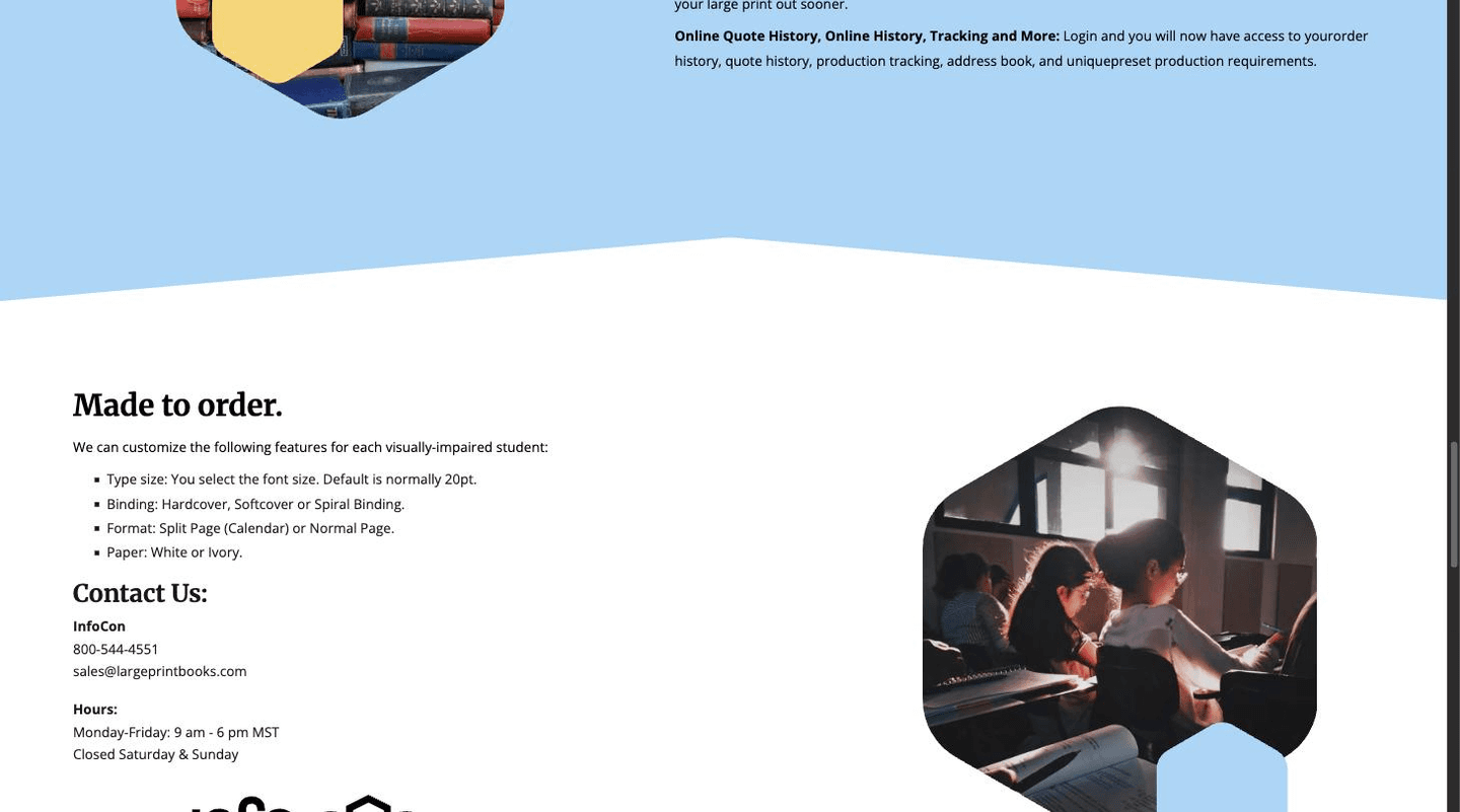
Made to orderper visually impaired student
- Type size
- scaled relative to the original
- Binding
- hardcover, softcover, or spiral
- Format
- split page (calendar) or full page
- Paper
- white or ivory
Ivory paper cuts glare, which matters a lot for low vision. Spiral binding lets a book lie flat so somebody using a magnifier isn’t fighting the spine with one hand. Split-page format exists because when you enlarge a textbook page past a certain point it stops fitting on one sheet and you have to decide what to do about that.
None of it is a flourish. It’s a set of manufacturing choices that exist because of how people with vision loss actually read, and my job was making it possible for a librarian to specify all four without needing training.
The decision: two brands, on purpose
When a company buys a competitor in the same category selling to the same customers, the default move is consolidation. Absorb the acquired brand, kill the second site, run one storefront, save the overhead. That’s what most people do.
We talked through the benefits and drawbacks together. It was his company and ultimately his call, and his decades in the market carried a lot more weight than my instincts about brand efficiency. We landed on keeping both, and the reasoning holds up.
- Both brands had history worth keeping. LRS had customer relationships and name recognition that predated the acquisition. Absorbing it would have thrown all of that away to save a domain renewal.
- Two brands means two ways into the same market. A second identity is a second revenue channel, another door into the same procurement conversation, not a copy of the first one.
- They could argue different things. This is the part that made it work instead of just tolerable.
InfoCon
Sells speed
“Quality Large Print. Without the Long Wait.” Saturated yellow, black high-contrast serif at display scale, hexagon photo masks, editorial pacing. Names a benefit and a pain point in six words.
Hero image is a kid in a classroom. It says K-12 before you’ve read anything.
LRS
Sells the system
“Check out what we are now doing.” White and utilitarian, bold condensed caps, black label chips, yellow nav bar. Institutional rather than editorial.
The homepage carousel is real curriculum. Reveal Math, Wonders, Fundations. The catalog is the pitch.
A buyer who needs a rush job and a buyer who wants a standing account with saved specs are not the same buyer, even when they work for the same district. Keeping both brands let each one talk to its own.
The part that isn’t a website
Underneath both brands I set up a custom quoting and checkout system, because institutional buying doesn’t work like retail. Districts and state contracts buy on purchase orders, against quotes, with production specs that repeat order after order after order.
The system
- Quoting
- 24/7 online quoting, no phone call, no rep
- Quote history
- log in, see everything you’ve asked for, order straight from an old quote
- Payment
- credit card or purchase order, PO upload any time
- Account
- order history, address book, preset production requirements reused every order
- Status
- initial sale, manufacturing, shipping, delivered
The order status pipeline is the piece I’d defend. These books get made after you order them. There’s no warehouse shelf to pull from. So a librarian who ordered forty enlarged textbooks in July needs to know whether they’ll be there for the first day of school, and before this the only way to find out was to pick up the phone and ask somebody.
Making manufacturing state visible turned the most common support question into something the customer could answer without us.
The argument I lost
The database was overly complicated and it made design harder than it needed to be. Every screen had to accommodate a data model carrying more structure than the task in front of the user actually required.
I pushed to simplify it. My argument was that a cleaner model would make the backend easier to work with and smooth out friction the customer feels around the edges. The owner didn’t see that friction as a significant problem, and he had decades of evidence about what his customers actually complain about. So it stayed.
Where it stands
Both brands are live and running independently: largeprintbooks.com and lrsbooks.com. Open both and the postural difference is the whole case study. Business has gone up every single year since, and 2026 is turning into the biggest year the company has had in production.
I’m not going to claim I caused all of that. An owner with decades in the market and a good acquisition did most of the work. But the system I built is what the sales side runs on now. Quotes go out without anybody picking up a phone, purchase orders arrive uploaded instead of faxed, and customers check production status themselves instead of calling to ask.
“Since our new site went live, along with the updates and improvements Dustin implemented, our business has increased by threefold. Even more impressive, many of the tasks that our team previously had to handle manually are now being completed by our customers themselves through the website.”
“The new site is not only more professional, intuitive, and user-friendly, but it has genuinely changed the way we operate and interact with our customers.”
That last part is the one I care about, because it is the thing I argued for and the thing that was hardest to sell. Every self-serve step I proposed was a step somebody on his team used to own, and asking a business to hand a job to its own customers is a bigger request than it sounds.