Onboarding a farmer without a salesperson
Building a two-sided RV marketplace out of nothing, and then living with the one decision that made the whole thing possible.
curbnturf.com- Role
- Founding designer
- Scope
- Brand, product, web, native
- Started
- December 2018
- Status
- Live, v2 in progress
Three people and a platform that was barely working
I joined CurbNTurf in December 2018 as one of three, at a company with no outside funding. Aaron Rawlins was starting the company, Jed Smith was building it, and I was designing it.
There was a product of a sort, limping along, and there was an idea worth chasing: connect RV travelers with private landowners. Farms, vineyards, ranches, driveways. There was no brand. No visual language. No coherent product experience. I built all of it.
The idea itself sits on two problems that happen to cancel each other out. There are way more RVers than there are places to put them, and the good campgrounds book out months ahead. Meanwhile, landowners and agribusinesses have space they aren’t using and margins they’d like to be better. Airbnb had already proven people will let strangers onto their property for money. Nobody had built it properly for rigs.
So the market was never the question. Getting both sides to show up was, with three people and no plan to hire a sales floor.
One decision shaped every screen after it
Our closest competitor, Harvest Hosts, ran on a membership subscription. Travelers paid a yearly fee to get access to the network. I went through them and everything adjacent, every onboarding flow and host dashboard I could get into, and we went the other way.
No membership fees. Sounds like pricing. It was really a design constraint.
Subscription revenue pays for humans. You can afford somebody to call a vineyard owner and walk him through listing his back field, because there’s recurring money behind the call. Take the subscription away and you can’t. Which means every landowner has to sign himself up, alone, with nobody on the phone.
That’s harder than it sounds, because this isn’t a SaaS buyer who lives in software all day. It’s a farmer or a rancher who has never listed anything online, doesn’t know what his land is worth to an RVer, doesn’t know what an RVer even needs, and has real questions about liability and strangers parking on his property.
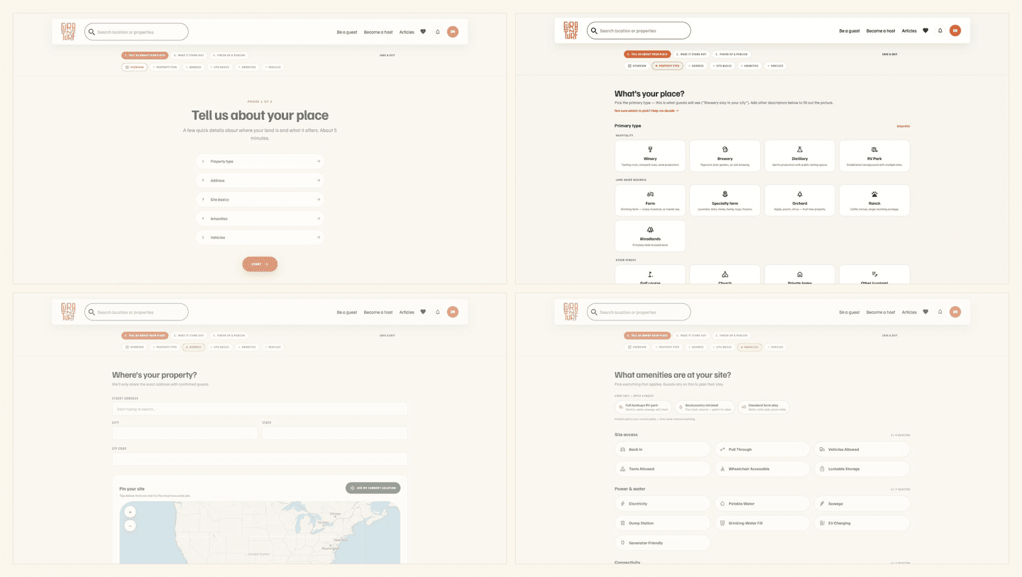
The onboarding has to do the entire job a salesperson would have done. Build trust. Explain the model. Pull out details the host doesn’t know are relevant. Get to a published listing before he gives up and goes back to whatever he was doing.
The bet the business sat on
Self-serve onboarding, or no business.
- No subscription
- so no sales floor to pay for
- Which means
- every landowner signs himself up
- Alone
- with nobody on the phone
Designing inside the thing we shipped
I started the way most designers start. Screens in Figma, hand them to Jed, wait. It worked and it was slow, and things got lost in the gap between the file and the build.
So we moved to Webflow and I started designing in it, which meant handing over usable code instead of a mockup and a conversation. Marketing site and app surfaces both.
That sounds like a tooling preference. It changed how fast a three-person company could move. The distance between “this should change” and “it’s live” basically collapsed, and that’s the difference between a small team that can turn on a dime and one that spends its runway in handoff meetings.
A ranch is not a house
I built the first version on Airbnb’s mental model, because it was proven and it mapped cleanly. A listing is a place. A host has a place. You book the place.
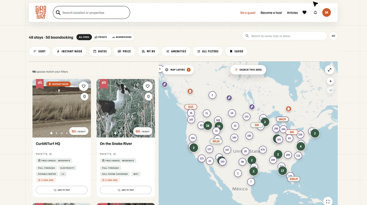
Land doesn’t work like that. A ranch isn’t a house. It’s five or six distinct spots with different sizes, hookups, access, and prices. One host, many sites. I had modeled one host, one site.
We found it the way you find things when the team is small and honest. Support tickets, and our sales reps. They travel the country signing hosts up and staying at the properties, so they were running into it in person, standing on a ranch with five obvious spots next to a product that only wanted one.
Fixing it took about a month. We built multisite on the app first, brought the changes across to the site, and migrated the existing hosts who needed it. The reps could use it too, which mattered more than we expected.
What the numbers actually say
This is the part I’d rather not publish, which is exactly why it’s here.
About twenty-five hosts start the process every week. About five of them publish a listing inside that week. So the self-serve bet is roughly one fifth true.
Some hosts really do sign themselves up with zero help, which is the thing the whole model needs, and it’s why the business runs without thirty people on a sales floor. But four out of five stall somewhere, and every one of those was a landowner interested enough to start.
That number is why we still have reps out in the field, and why I built them internal tools the host-facing product never exposes. The escape hatch isn’t an admission the bet failed. It’s what you build when a bet is partly working and you want the accounts worth a phone call to actually get one.
It’s also the number driving version two.
Version two
V2 exists for two honest reasons. The product had picked up a lot of capability over the years, more tools and feature sets for hosts and guests than v1 was ever built to hold. And v1 had aged. It looked its years.
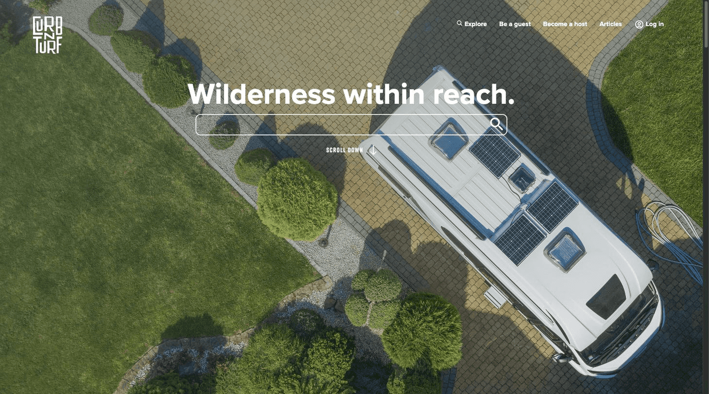
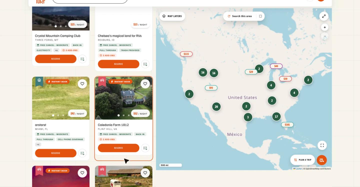
But the real shift is what the first screen is for. V1 explained the service. V2 lets you use it. The old homepage opened with a headline, an empty search box, and several paragraphs describing what a two-sided marketplace is. The new one opens with a working query. Destination, dates, your rig. Plus three ways to start, depending on how you’re thinking about it: you know where you’re going, you’re traveling between places, or you’re just looking at the map.
The onboarding is substantially the same design I made in 2019, with the flow tightened rather than rebuilt. We’re extending it now with AI that gathers information local to the host while he signs up, so he has to supply less and the listing shows up more complete.
Same bet, pushed harder. The less a host has to know, the more hosts you get. Whether that moves five out of twenty-five is the open question. I’ll know soon.
The apps
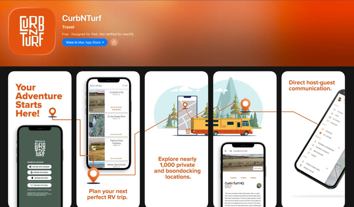
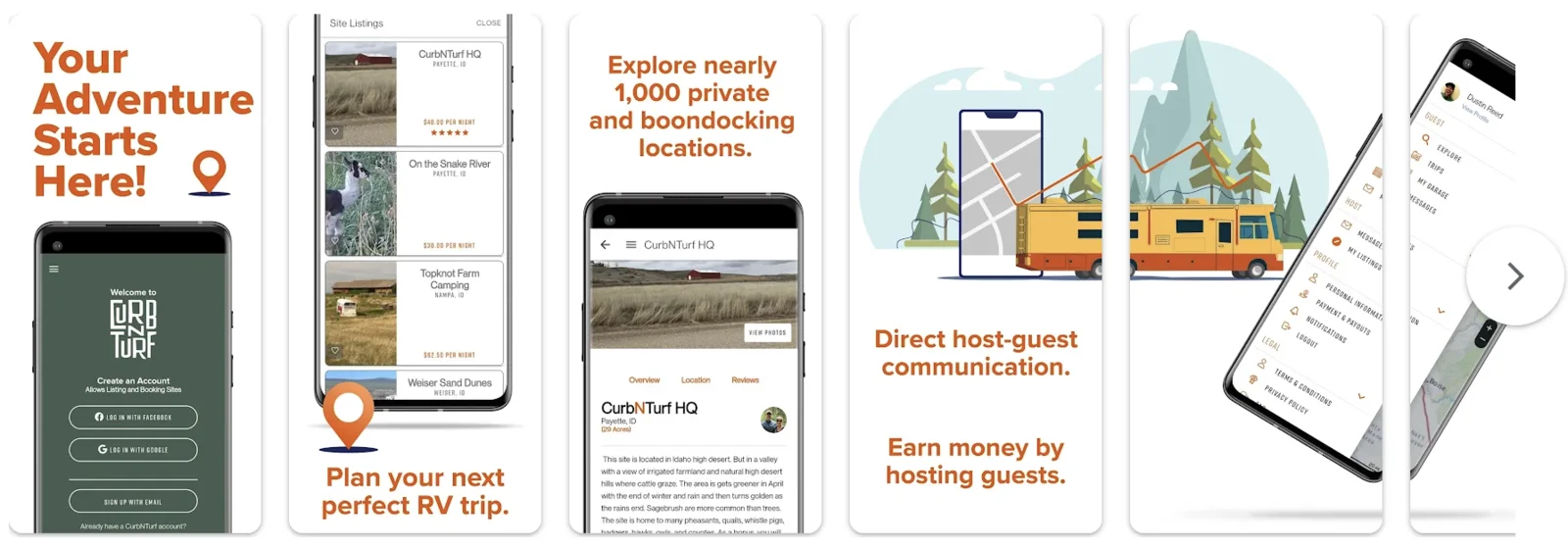
iOS and Android both shipped, free to download and use. I designed the primary app experience, the core screens and flows. Jed started the build, and Scott Henscheid led it once he came on, taking v1 of both apps to the stores. Scott handled the secondary and smaller-scale decisions, which I reviewed and approved.
The hard part wasn’t visual. It was designing inside the framework’s constraints, and the clearest example is navigation. The app’s menu system was built on React Native, which meant its structure didn’t map onto what we’d built for the web. Some layouts exist only in the app and have no web equivalent at all.
The temptation there is to force parity. Make both platforms match so the brand feels consistent and nobody has to think about it twice. I didn’t. Fighting a framework to reproduce a web layout on a phone gets you something that feels wrong on both, so I let the app keep its own structures where the framework wanted them, and held consistency at the level of brand, language, and behavior instead of layout.
The system that held it together
Holding consistency at the level of brand rather than layout only works if there is a brand to hold it at. So the actual deliverable underneath eight years of screens is a small one: a mark, a typeface, six colors, and a set of drawings.
It is deliberately small. I was one designer supporting a web app, two native apps, a marketing site, internal tools for the sales team, and two app store listings. Every component I added was a component I would personally maintain for years, and that is a different incentive than designing a library someone else inherits. The system stayed narrow because I was the one paying for it to be wide.


Familjen Grotesk carries all of it. One variable family, which matters more on a phone than it does in a style guide: two families means two font loads on a connection a traveler is using from a field in eastern Oregon.
Core palette · Familjen Grotesk
- #e3530d
Primary
Actions, price, the brand
- #465d50
Green
Surfaces, host side
- #9cb29f
Green light
Amenity chips, map pins
- #212722
Secondary 900
Type on cream
- #d8d6d6
Light
Rules, disabled
- #f6f8f9
Gray 100
Page beneath cards
Class A
Coach
Class B
Camper van
Class C
Cab-over
Fifth Wheel
Gooseneck
Travel Trailer
Bumper pull
Truck Camper
Bed-mounted
Teardrop
Compact tow
Pop-up Camper
Folding
The drawings are the part of the system I would defend hardest. They are not decoration. A rig type is a filter, a badge on a listing card, a step in onboarding, a map pin, and a field in a traveler’s garage, and in every one of those places it has to be recognizable at a glance by someone who might have bought their first trailer last week. Words like Class B and fifth wheel do not do that. A picture of the thing in the driveway does.
Where it stands
500+
Hosts with published listings, from farmland to urban driveways
4.8
Average host rating
2
Native apps shipped, iOS and Android, free to use
Since 2018
Designing and shipping the same product
One product since 2018. Most designers hand something over and never find out what it cost. I’ve had to keep using mine.
It is not finished. The v2 redesign is underway now, reframing the whole product around the freedom of the trip rather than the mechanics of booking a spot, and I am writing backend alongside the design work to ship it.